'The Hop' Branding Rollout
-
Swift

- Posts: 13273
- Joined: Sat Mar 06, 2004 1:23 pm
- Favourite Vehicle: Porshe 911 Carerra
- Location: Ettalong- the world capital of 0405s.
Re: 'The Hop' Branding Rollout
The process of making Sydney that much more dystopian continues.
NSW, the state that embraces mediocrity.
Re: 'The Hop' Branding Rollout
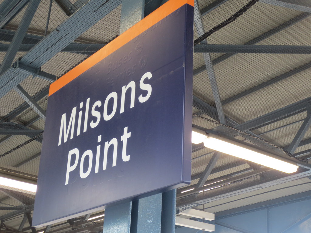
Several upper north shore stations have also been converted to, or are in the process of converting to, the new graphics.
For some platform indicators and emergency help point signs I have noticed a few instances of of the new graphics being pasted over the old fixtures instead of the fixture being replaced which doesn't look so good.
For some platform indicators and emergency help point signs I have noticed a few instances of of the new graphics being pasted over the old fixtures instead of the fixture being replaced which doesn't look so good.
Re: 'The Hop' Branding Rollout
Same along the Inner West including Summer Hill, Stanmore and little old Macdonaldtown.ed24 wrote:Several upper north shore stations have also been converted to, or are in the process of converting to, the new graphics.
An asset of NSW. All opinions/comments are strictly my own.
M 5885.
M 5885.
-
Swift
- Posts: 13273
- Joined: Sat Mar 06, 2004 1:23 pm
- Favourite Vehicle: Porshe 911 Carerra
- Location: Ettalong- the world capital of 0405s.
Re: 'The Hop' Branding Rollout
I wish they would rollout the original roundel shaped signs Nick Greiner and co. took away from us in the early 1990s without asking if we wanted it.
NSW, the state that embraces mediocrity.
Re: 'The Hop' Branding Rollout
Both stops on South Pde, Campsie were changed to TfNSW J-pole today. There were no stand letters. All the blade bus stop signs on Beamish St have still not been changed.
EDIT 25/7:
More stops on Beamish St changed today.
Blade signs changed to P-poles and J-poles changed to new J-poles.
EDIT 25/7:
More stops on Beamish St changed today.
Blade signs changed to P-poles and J-poles changed to new J-poles.
Last edited by sunnyyan on Tue Jul 25, 2017 5:22 pm, edited 1 time in total.
-
Jurassic_Joke
- Posts: 1138
- Joined: Sun Dec 27, 2015 10:08 pm
Re: 'The Hop' Branding Rollout
For those curious, here's what they've done at Waverton, they've done something new with the platform signage.
A step in the right direction
https://m.imgur.com/a/zoHAn
Sorry not bothered to resize the image so I can upload it here And these signs can be found at the upper north shore stations getting the refit too.
But you know, especially as we know this whole mess was done for changes sake, this is really what it should've been since the start. To name a new. Labyrinths like Town Hall, Wynyard, Blacktown. They need general information signs like that. And only late into the process are they actually bothering now to fix it, only stations not yet repainted, after probably countless feedback saying how bad and totally useless the new signage is.
A step in the right direction
https://m.imgur.com/a/zoHAn
Sorry not bothered to resize the image so I can upload it here
But you know, especially as we know this whole mess was done for changes sake, this is really what it should've been since the start. To name a new. Labyrinths like Town Hall, Wynyard, Blacktown. They need general information signs like that. And only late into the process are they actually bothering now to fix it, only stations not yet repainted, after probably countless feedback saying how bad and totally useless the new signage is.
-
crazyturbo76

- Posts: 1135
- Joined: Sun Apr 07, 2013 3:02 pm
- Favourite Vehicle: MB OC500LE/Custom 'CB80'
- Location: Usually in Region 1 territory
Re: 'The Hop' Branding Rollout
Wentworthville station can be added to the list of T1 stations with Hop signage - noticed some of the station signs have been replaced with new Hop signage but there are still a considerable number of blue and white signs on the platform as of the middle of this week.
I suspect Toongabbie will be next in line for that treatment.
I suspect Toongabbie will be next in line for that treatment.
-
Swift
- Posts: 13273
- Joined: Sat Mar 06, 2004 1:23 pm
- Favourite Vehicle: Porshe 911 Carerra
- Location: Ettalong- the world capital of 0405s.
Re: 'The Hop' Branding Rollout
Gosh, it's like gentrification has hit the railways. 

NSW, the state that embraces mediocrity.
Re: 'The Hop' Branding Rollout
sunnyyan wrote:Both stops on South Pde, Campsie were changed to TfNSW J-pole today. There were no stand letters. All the blade bus stop signs on Beamish St have still not been changed.
EDIT 25/7:
More stops on Beamish St changed today.
Blade signs changed to P-poles and J-poles changed to new J-poles.
I noticed these changes on Beamish St today, still no changes on the Northern side. I also saw a new hop blade on Bexley Rd near Vickiffe St, Clemton Park (facing North) - this is probably the first time that I've seen a stand alone blue hop bus stop not located next to a train station, Interchange, shops etc.
-
BanksfielderIdiot823

- Posts: 221
- Joined: Wed Jul 26, 2017 12:11 am
- Favourite Vehicle: Volgrens and Ford Falcons
- Location: Edensor Park, NSW or Dandenong, VIC
Re: 'The Hop' Branding Rollout
Clyde has received the new orange signs around the city-end of the platforms. As usual, no mention of "Change here for Carlingford line".
Some blue and white signs still exist by the shelters and the concourse.
Some blue and white signs still exist by the shelters and the concourse.
Volgren all day, every day
Dear T80; If the decker's not a Volgren, I'm not interested.
Westbus Fairfield + Dandy Hub = perfection
Good old Collingwood forever.
Long live the potato cake.
Dear T80; If the decker's not a Volgren, I'm not interested.
Westbus Fairfield + Dandy Hub = perfection
Good old Collingwood forever.
Long live the potato cake.
-
Swift
- Posts: 13273
- Joined: Sat Mar 06, 2004 1:23 pm
- Favourite Vehicle: Porshe 911 Carerra
- Location: Ettalong- the world capital of 0405s.
Re: 'The Hop' Branding Rollout
The orange station names are harder to read from a distance. All this "plop" signage is a new level in blandness for the city. They nailed it in 1974 with the L7 logo that became instantly associated with our public transport system. The current admin just had to leave their "scent" by changing everything with these unsophisticated, generic looking New York style symbols. And their negative image problem has merely transferred over to this new high cost signage.
NSW, the state that embraces mediocrity.
Re: 'The Hop' Branding Rollout
Blue hop bus stops have appeared on Homer St between Bexley Rd & Morgan St, Earlwood.
-
Jurassic_Joke
- Posts: 1138
- Joined: Sun Dec 27, 2015 10:08 pm
Re: 'The Hop' Branding Rollout
If we look back towards the trial period, I still find myself preferring what they came up with there.
Examples: (photos not mine, from Google Images, credit due;)
Platform Signage. //uploads.tapatalk-cdn.com/20130926/4ejuvu9y.jpg - Should've left it here. Instead went and made it worse, removed line information because TfNSW doesn't want people to stop and think about where they're going, just herd em all into the platform and let them figure it out from there.
Station name signage https://c1.staticflickr.com/2/1577/2414 ... f06a_b.jpg - closer to the Cityrail design. Colour scheme looks more neutral and not like its from silly, mutilated cartoon.
I remember as Penny Sharpe was a staunch critic back in the day of this entire mess. I wonder if she was still the shadow minister, got elected in 2019, if shed do anything about it - Jody McKay is borderline-useless as shadow minister, only ever talks about transport issues that directly affect her own electorate coughcough WestConnexx coughcough Inner West Buses selloff coughcough
-
Swift
- Posts: 13273
- Joined: Sat Mar 06, 2004 1:23 pm
- Favourite Vehicle: Porshe 911 Carerra
- Location: Ettalong- the world capital of 0405s.
Re: 'The Hop' Branding Rollout
Ole Jodes seems to badly affect you. I'd stay away from the mere mention of her again or it might become chronic.
I somehow wouldn't count on henny Penny, going by Labor's propensity of quietly retaining the Liberals previous daft decisions and not changing them.
I somehow wouldn't count on henny Penny, going by Labor's propensity of quietly retaining the Liberals previous daft decisions and not changing them.
NSW, the state that embraces mediocrity.

Re: 'The Hop' Branding Rollout
I was at Hurstville today - an unfamiliar location for me - and nearly missed my bus because I subconsciously went to the first bus stand with a large "B" when the trip planner said stand B. I waited there dumbly for a while and then realised that everyone else was at the other stand boarding bus 450 at the actual stand B - I was at Stand A, which is only visible on the sign in tiny black print. Maddening - and I'm supposed to be a Transport enthusiast who knows these things. How is the tourist or uninformed casual user expected to make out?
-
Swift
- Posts: 13273
- Joined: Sat Mar 06, 2004 1:23 pm
- Favourite Vehicle: Porshe 911 Carerra
- Location: Ettalong- the world capital of 0405s.
Re: 'The Hop' Branding Rollout
We all know Sydney's transport is increasingly becoming geared to daily users and the rest are on their own like headless chooks!!
NSW, the state that embraces mediocrity.
Re: 'The Hop' Branding Rollout
These things have always been poor in Sydney. I actually think they've been improving, although the Hop Branding is no part of that.jpp42 wrote:I was at Hurstville today - an unfamiliar location for me - and nearly missed my bus because I subconsciously went to the first bus stand with a large "B" when the trip planner said stand B. I waited there dumbly for a while and then realised that everyone else was at the other stand boarding bus 450 at the actual stand B - I was at Stand A, which is only visible on the sign in tiny black print. Maddening - and I'm supposed to be a Transport enthusiast who knows these things. How is the tourist or uninformed casual user expected to make out?
Re: 'The Hop' Branding Rollout
The HOP plague that has swept through from Campsie to Earlwood has continued to fester away in Earlwood resulting in Earlwood shops having not just new HOP bus stops, but actual bus stop stands A to F. 
Campsie Station did not receive bus stop stand lettering, only standard blue hop bus stops yet Earlwood shops receives bus stop stand lettering, what's going on with these signage experts??? This is the first time that I've seen a local shopping strip (bus only - no trains) have bus stop stand lettering, the same goes for the Campsie Station situation as well.
Campsie Station did not receive bus stop stand lettering, only standard blue hop bus stops yet Earlwood shops receives bus stop stand lettering, what's going on with these signage experts??? This is the first time that I've seen a local shopping strip (bus only - no trains) have bus stop stand lettering, the same goes for the Campsie Station situation as well.
Re: 'The Hop' Branding Rollout
The route 412 has blue hop bus stops between Campsie Station and Permanent Ave & Wardell Rd, Earlwood. There are only a handful of bus stops between the above mentioned area that need to be replaced - old style yellow J-stem and the plinths from the MoT from 2002 onwards.
I remember during 2010 quite a number of J-stems were replaced by new plinths on routes 423, 490 & 492 and then to my knowledge no other routes ever received the same sort of dedicated attention - happy to be corrected. I did see a number of the MoT plinths appear at major bus stops and of course with the introduction and expansion of the metrobus brand.
I remember during 2010 quite a number of J-stems were replaced by new plinths on routes 423, 490 & 492 and then to my knowledge no other routes ever received the same sort of dedicated attention - happy to be corrected. I did see a number of the MoT plinths appear at major bus stops and of course with the introduction and expansion of the metrobus brand.
Re: 'The Hop' Branding Rollout
HOP bus stops are now appearing along the Northern end of Kingsgrove Rd, even the yellow J-stem at the front of Kingsgrove Depot (route 423) has been replaced with a blue Hop J-stem. The former yellow J-stem was only put in place in 2015 when TfNSW decided that the former bus stop for route 423-IN on the depot premises be reinstated as OPAL would recognise the beginning of the trip from Kingsgrove Depot and not on Kingsgrove Rd near Omnibus Rd.
Re: 'The Hop' Branding Rollout
When passing through the Blue Mountains I was reminded that so many stations were never even upgraded to the mid 2000s style blue/white station branding - will the current orange hop branding be around long enough to be implemented across the whole network...?
-
Swift
- Posts: 13273
- Joined: Sat Mar 06, 2004 1:23 pm
- Favourite Vehicle: Porshe 911 Carerra
- Location: Ettalong- the world capital of 0405s.
Re: 'The Hop' Branding Rollout
It's the Liberals (God's government ) who have this impulse to change everything as though they are somehow cleansing all signs of Labor's reign and miraculously fixing everything.They have been doing it for decades now. Nick Greiner was the godfather if this style of administration. Wipe away Labor's achievements and say look what we achieved and blame the " previous Labor governmrnt " for anything that goes wrong, even six years later and beyond.
NSW, the state that embraces mediocrity.
-
Jurassic_Joke
- Posts: 1138
- Joined: Sun Dec 27, 2015 10:08 pm
Re: 'The Hop' Branding Rollout
Glenfield has received some new platform signage sometime very recently, in a similar style as to what came to St James recently as well. Good good, I'm glad to see they're listening to negative feedback over way finding at the station. Blacktown, Redfern, Wynyard to name a few could really do with some of these instead of leaving it to the customer to guess or use their mobile data.
Also take note of how the T2 signage seems to have already been adjusted to get ready for the timetable change later this year - T2 Airport Line towards Campbeltown, while T2 Inner West and South towards Leppington. While funnily, Cumberland Line is still showing as towards Campbelltown - not for long! But I welcome this signage
(sorry about the wonky size of the photos, just trying my best to get them uploaded here!)
- Attachments
-
- IMG_8423.JPG (25.38 KiB) Viewed 9421 times
-
- IMG_8422.JPG (33.92 KiB) Viewed 9421 times
-
- IMG_8420.JPG (35.04 KiB) Viewed 9421 times
-
Campbelltown busboy

- Posts: 2129
- Joined: Sun Aug 11, 2013 1:23 pm
- Location: Ruse/Campbelltown City NSW
Re: 'The Hop' Branding Rollout
I spotted the workmen doing Cityrail to hop sign swaps at Glenfield back in JuneJurassic_Joke wrote:Glenfield has received some new platform signage sometime very recently, in a similar style as to what came to St James recently as well. Good good, I'm glad to see they're listening to negative feedback over way finding at the station. Blacktown, Redfern, Wynyard to name a few could really do with some of these instead of leaving it to the customer to guess or use their mobile data.
Also take note of how the T2 signage seems to have already been adjusted to get ready for the timetable change later this year - T2 Airport Line towards Campbeltown, while T2 Inner West and South towards Leppington. While funnily, Cumberland Line is still showing as towards Campbelltown - not for long! But I welcome this signage
(sorry about the wonky size of the photos, just trying my best to get them uploaded here!)
Re: 'The Hop' Branding Rollout
Well the new Green T8 and light blue T2 means ait of these signs now need to get replaced.
https://www.transport.nsw.gov.au/system ... g-2017.pdf
https://www.transport.nsw.gov.au/system ... g-2017.pdf