'The Hop' Branding Rollout
-
ihearttrains
Re: 'The Hop' Branding Rollout
The work at Milson's Point is part of a test site evaluation of new signs for the entire (and unified) transport system- not just rail. New (temporary?) signage has also been installed at the Ferry Wharf. the Hop is a corporate identity- the signs follow a separate strategy- different purposes
Re: 'The Hop' Branding Rollout
Which ferry wharf did they put the signs?
And what about buses?
And what about buses?
-
VivalaBuses

- Posts: 1193
- Joined: Sat Mar 28, 2009 4:50 pm
- Favourite Vehicle: Scania K310UB, Volvo B7RLE
- Location: Where buses in TfNSW livery run!
Re: 'The Hop' Branding Rollout
Staff at Wynyard station were wearing "The Hop" uniforms today.
Time for a new signature!
-
TheOpalUser

- Posts: 902
- Joined: Thu Oct 25, 2012 4:13 pm
Re: 'The Hop' Branding Rollout
Town Hall station staff were also decked out in the new uniforms today.VivalaBuses wrote:Staff at Wynyard station were wearing "The Hop" uniforms today.
Posts and comments made here are my own personal opinions, and not on behalf of my employer.
-
boxythingy

- Posts: 3891
- Joined: Mon Jun 13, 2011 2:48 pm
- Favourite Vehicle: Anything not 'B-set' w/problms
Re: 'The Hop' Branding Rollout
One Wolli Creek staff was seen wearing new uniform.
-
cityrailwaratah a13
- Posts: 66
- Joined: Tue Mar 19, 2013 7:15 pm
Re: Rail Observations May 2013
looks like sydney trains has started at sutherland
-
boxythingy
- Posts: 3891
- Joined: Mon Jun 13, 2011 2:48 pm
- Favourite Vehicle: Anything not 'B-set' w/problms
Re: 'The Hop' Branding Rollout
So I just noticed all these new photos Kypros1992 has uploaded:
http://www.flickr.com/photos/kypros1992/
What the heck is T1? Terminal 1? So Jetstar
Not only do they remind me Telstra, but everything these days has that Windows 8 Metro UI look. Flat, Solid colours with squares. The Blue and orange also reminds me of this. Wonder if someone came back from a trip in Hong Kong recently...
-
TheOpalUser
- Posts: 902
- Joined: Thu Oct 25, 2012 4:13 pm
Re: 'The Hop' Branding Rollout
I'm wondering if it's going to be 'Train Line 1'; they have the 'Orange' for the new Sydney Trains branding.boxythingy wrote:So I just noticed all these new photos Kypros1992 has uploaded:
http://www.flickr.com/photos/kypros1992/
What the heck is T1? Terminal 1? So Jetstar
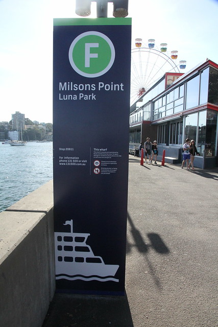
Downstairs, signage has been updated for Buses and Ferries too,
B in Blue for buses
and F in Green for ferries
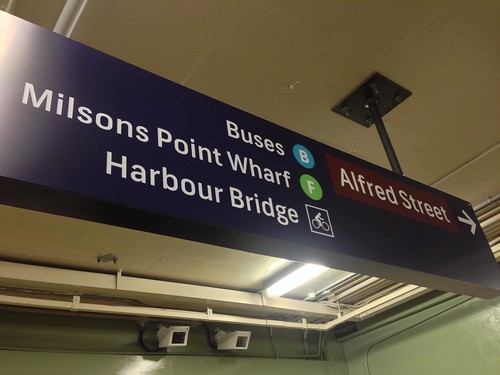
Milsons Point Station IMG_1097 by BeauGiles, on Flickr
But my favourite change so far is the new graphic used for the lift.
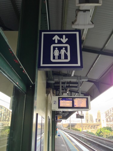
Milsons Point Station IMG_1089 by BeauGiles, on Flickr
Button is for men only.
Vs the current Lift graphic.
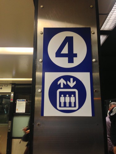
Town Hall Station IMG_1116 by BeauGiles, on Flickr.
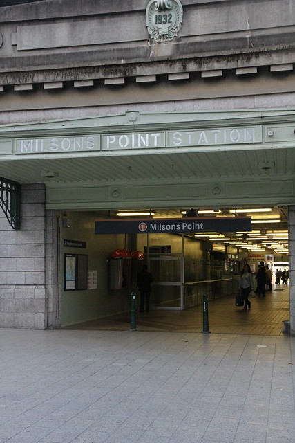
There's also an empty circle at the entrance for Milsons Point Station; so I'm curious as to what will go here.
Will we just see the new Sydney Trains Hop logo squeezed in here? Why in a circle?

Milsons Point Station IMG_1103 by BeauGiles, on Flickr
Posts and comments made here are my own personal opinions, and not on behalf of my employer.
-
boxythingy
- Posts: 3891
- Joined: Mon Jun 13, 2011 2:48 pm
- Favourite Vehicle: Anything not 'B-set' w/problms
Re: 'The Hop' Branding Rollout
I know Orange=Trains. I'm still trying to figure out why they kept the indigo/dark blue. Another question why (B) and (F) are used. Why letters, not their respective coloured hop or the transport mode logos (pic of bus/boat)?
How many lines does Milsons Point intersect? How many lines does the entire Network have? Why would you want to emphasise 'Line 1' OVER the Platform number? Makes no sense at all, our network isn't:

How many lines does Milsons Point intersect? How many lines does the entire Network have? Why would you want to emphasise 'Line 1' OVER the Platform number? Makes no sense at all, our network isn't:
Last edited by boxythingy on Thu May 02, 2013 9:31 pm, edited 7 times in total.
-
drpurpleturtle
- Posts: 167
- Joined: Mon Aug 15, 2011 7:51 pm
- Location: Sydney
Re: 'The Hop' Branding Rollout
Staff at Circular Quay railway station are now wearing "The Hop" Uniforms.
Re: 'The Hop' Branding Rollout
It looks like they are going to introduce route or line numbers. Interesting to see how they would do this, as it really only works well with completely segregated Metro style lines. It will also be interesting to see how long it takes them to introduce this As a lot of stations haven't even got the current branding.
Last edited by quaidy on Fri May 03, 2013 9:42 am, edited 1 time in total.
-
crimsontide
- Posts: 1685
- Joined: Thu Feb 15, 2007 4:15 pm
Re: 'The Hop' Branding Rollout
In answer to the blank circle, keeping in line with the Bus and Ferry, expect to see it Orange with a T
Re: 'The Hop' Branding Rollout
First thing I noticed. (B) and (F) seems like a backward step (early 2000s era?), especially since Taxis have their own logo. Bus and Ferry logo in their respective colours would've looked great. Maybe it will make sense later on. We'll see.boxythingy wrote:I know Orange=Trains. I'm still trying to figure out why they kept the indigo/dark blue. Another question why (B) and (F) are used. Why letters, not their respective coloured hop or the transport mode logos (pic of bus/boat)?
Other than that, it looks great.
-
TheOpalUser
- Posts: 902
- Joined: Thu Oct 25, 2012 4:13 pm
Re: 'The Hop' Branding Rollout
Mr Twig wrote:First thing I noticed. (B) and (F) seems like a backward step (early 2000s era?), especially since Taxis have their own logo. Bus and Ferry logo in their respective colours would've looked great. Maybe it will make sense later on. We'll see.boxythingy wrote:I know Orange=Trains. I'm still trying to figure out why they kept the indigo/dark blue. Another question why (B) and (F) are used. Why letters, not their respective coloured hop or the transport mode logos (pic of bus/boat)?
Other than that, it looks great.
I'm still wondering when we'll see the Hop logo itself making an appearance. We haven't seen the logos anywhere yet, and it does mention that they'll be prominently displayed back in the original announcement media release.crimsontide wrote:In answer to the blank circle, keeping in line with the Bus and Ferry, expect to see it Orange with a T

(cropped from http://www.transport.nsw.gov.au/sites/d ... anding.jpg)
There will also be a new transport brand introduced to make all public transport information simpler and stations, bus stops, wharves and light rail stops more easily recognisable for commuters and tourists.
“When customers use public transport today they’re bombarded with hundreds of competing logos, thousands of posters, multiple websites and around 800 different brochures – we need to simplify this to improve the customer experience,” Ms Berejiklian said.
“Unlike other global cities like London and Paris, we have never had one integrated and recognisable brand for transport.
“When you go to London and see the round symbol you know there is public transport nearby, whether it is the underground or a bus or other mode – it’s an integrated system that works well.”
The new brand, known as ‘The Hop’, provides an overarching integrated brand for public transport services and includes all modes - buses, trains, ferries and light rail – which will each be a separate colour.
http://www.transport.nsw.gov.au/media-r ... er-service
(emphasis mine)
Unless they're literally ripping London off and stealing the "...round symbol you know there is public transport nearby"
For comparison, here are the different signs used in London for each of the transport modes.

Posts and comments made here are my own personal opinions, and not on behalf of my employer.
Re: 'The Hop' Branding Rollout
A series of different coloured L7's would have been a good way to do, especially with the longstanding association of the L7 and public transport in Sydney.
It would be unheard of for London to change from the roundel with every change of government.
It would be unheard of for London to change from the roundel with every change of government.
-
TheOpalUser
- Posts: 902
- Joined: Thu Oct 25, 2012 4:13 pm
Re: 'The Hop' Branding Rollout

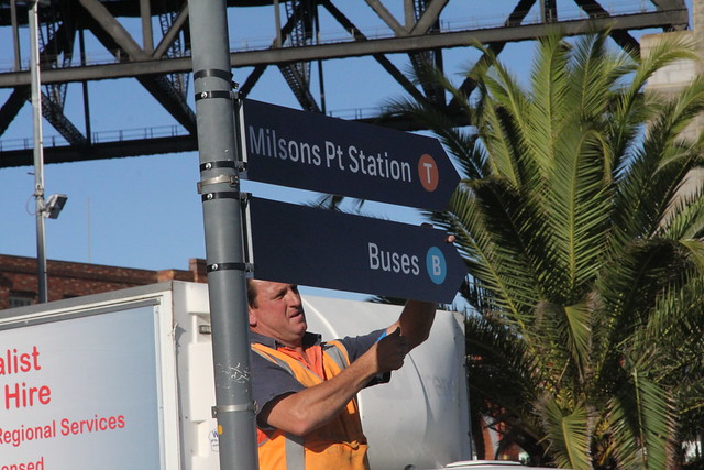
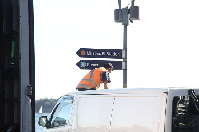
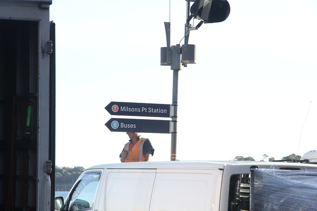
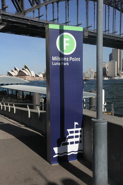
New signage just going up at Milsons Point Wharf.
B in a blue circle for Buses
T in a (light?) orange circle for Trains
F in a green circle for ferries
Posts and comments made here are my own personal opinions, and not on behalf of my employer.
-
CB80

- Posts: 3731
- Joined: Sat Aug 13, 2005 5:13 pm
- Favourite Vehicle: Leyland Tiger
- Location: Melbourne.
Re: 'The Hop' Branding Rollout
The train/ferry signage is already mostly sufficient, their main focus at the moment should be doing something about the absolutely pathetic standard of bus signage and information in most of Sydney.
Re: 'The Hop' Branding Rollout
So nothing is actually going to have "the hop" on it? Just coloured circles?
Re: 'The Hop' Branding Rollout
Yes it's a must. I went walking thru Minto to go friends place and there were pols sticking up outta ground saying BUSCB80 wrote:The train/ferry signage is already mostly sufficient, their main focus at the moment should be doing something about the absolutely pathetic standard of bus signage and information in most of Sydney.
-
kypros1992
- Posts: 947
- Joined: Sat Aug 28, 2010 10:14 am
Re: 'The Hop' Branding Rollout
or some areas where is just a shelter or bus zone signage
Re: 'The Hop' Branding Rollout
I wonder who got paid the big bucks for that.BeauGiles wrote: B in a blue circle for Buses
T in a (light?) orange circle for Trains
F in a green circle for ferries
-
TheOpalUser
- Posts: 902
- Joined: Thu Oct 25, 2012 4:13 pm
Re: 'The Hop' Branding Rollout
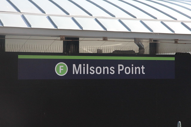
So the 'circles' on the signs outside the station have been filled.
Milsons Point IMG_7039 by BeauGiles, on Flickr
The signage outside the station on the street level now also sports a T.
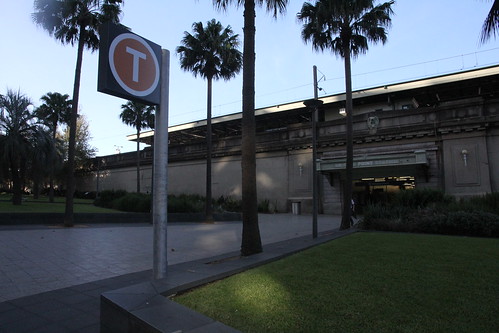
Milsons Point IMG_7036 by BeauGiles, on Flickr
Street signs pointing to the wharf have the new design
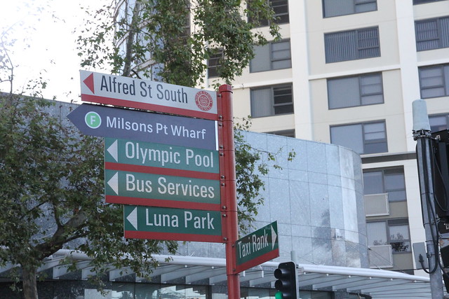
Milsons Point IMG_7034 by BeauGiles, on Flickr
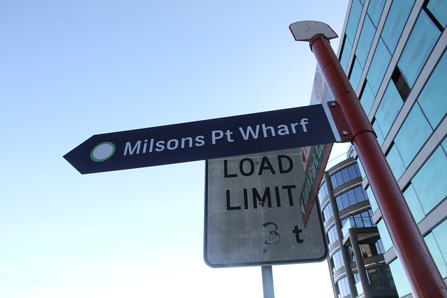
Milsons Point IMG_7030 by BeauGiles, on Flickr
And as posted above, new signs have gone in down by the wharf.
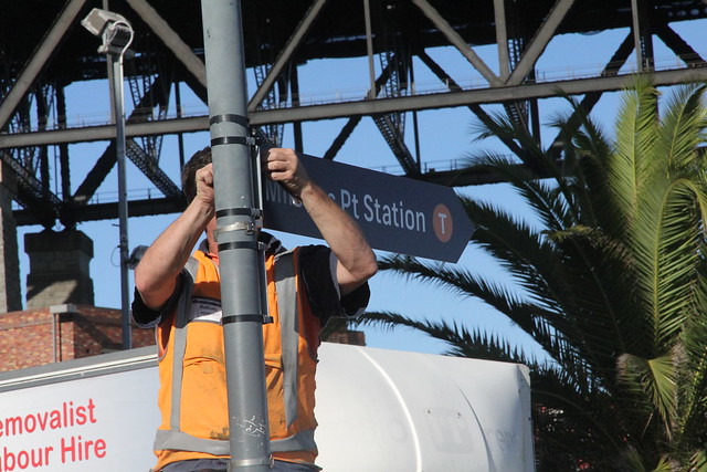
Milsons Point IMG_7014 by BeauGiles, on Flickr
Milsons Point IMG_7016 by BeauGiles, on Flickr
After being put up, they were already replaced with new stickers; same coloured circles, but the new stickers have a thick white border around them
Milsons Point IMG_7020 by BeauGiles, on Flickr
Milsons Point IMG_7024 by BeauGiles, on Flickr
As mentioned, Milsons Point Wharf has also had a splash of fresh paint.
Milsons Point IMG_7008 by BeauGiles, on Flickr
Milsons Point IMG_7002 by BeauGiles, on Flickr
Milsons Point IMG_7001 by BeauGiles, on Flickr
And finally, the 'T1' signs that appeared at Milsons Point Station have been replaced with stickers for the platform numbers.
Milsons Point IMG_1133 by BeauGiles, on Flickr
Milsons Point IMG_7058 by BeauGiles, on Flickr
(While taking photos on the main station concourse, I was also told that I couldn't take any photos at the station, and that I was to cease and leave)
Milsons Point IMG_7039 by BeauGiles, on Flickr
The signage outside the station on the street level now also sports a T.
Milsons Point IMG_7036 by BeauGiles, on Flickr
Street signs pointing to the wharf have the new design
Milsons Point IMG_7034 by BeauGiles, on Flickr
Milsons Point IMG_7030 by BeauGiles, on Flickr
And as posted above, new signs have gone in down by the wharf.
Milsons Point IMG_7014 by BeauGiles, on Flickr
Milsons Point IMG_7016 by BeauGiles, on Flickr
After being put up, they were already replaced with new stickers; same coloured circles, but the new stickers have a thick white border around them
Milsons Point IMG_7020 by BeauGiles, on Flickr
Milsons Point IMG_7024 by BeauGiles, on Flickr
As mentioned, Milsons Point Wharf has also had a splash of fresh paint.
Milsons Point IMG_7008 by BeauGiles, on Flickr
Milsons Point IMG_7002 by BeauGiles, on Flickr
Milsons Point IMG_7001 by BeauGiles, on Flickr
And finally, the 'T1' signs that appeared at Milsons Point Station have been replaced with stickers for the platform numbers.
Milsons Point IMG_1133 by BeauGiles, on Flickr
Milsons Point IMG_7058 by BeauGiles, on Flickr
(While taking photos on the main station concourse, I was also told that I couldn't take any photos at the station, and that I was to cease and leave)
Posts and comments made here are my own personal opinions, and not on behalf of my employer.
-
boxythingy
- Posts: 3891
- Joined: Mon Jun 13, 2011 2:48 pm
- Favourite Vehicle: Anything not 'B-set' w/problms
Re: 'The Hop' Branding Rollout
I have a hunch there will be inconsistencies with some circles having white rings and those without it around the coloured circles.
More stupidity in decreasing the original functionality, why cover up the name with a big round circle with T in it?
The location signs would have been nicer if distance information was included.
More stupidity in decreasing the original functionality, why cover up the name with a big round circle with T in it?
The location signs would have been nicer if distance information was included.
-
macpro622776
- Posts: 337
- Joined: Sat Apr 28, 2012 10:08 pm
Re: 'The Hop' Branding Rollout
So what's going to happen to all those people who may not be able to read English that well? Now they have to remember a colour and letter as well, instead of simple pictographics.
-
boxythingy
- Posts: 3891
- Joined: Mon Jun 13, 2011 2:48 pm
- Favourite Vehicle: Anything not 'B-set' w/problms
Re: 'The Hop' Branding Rollout
The designers are PROBABLY obsessed with Telstra and things Retro:

This, in my opinion would make slightly more sense:

modified from source:http://www.flickr.com/photos/comeng301m/8701583468/
This, in my opinion would make slightly more sense:
modified from source:http://www.flickr.com/photos/comeng301m/8701583468/